 XAML - レイアウトする
開発環境: Visual Studio
2008
1.目的
XAML の基本的なコントロールの説明です。
2.参考書
(1) 参考書を書く。
3.レイアウト
コントロールをウィンドウに配置するためのコントロールとして、パネルやグリッドなど、多くのものが用意されていて、どれを使えばよいのか迷いました。そこで、クラス構造からではなく、機能でまとめてみました。
Panel派生クラスには、Canvas, DockPanel, Grid, TabPanel,
ToolBarOverflowPanel, UniformGrid, StackPanel, VirtualizingPanel,
WrapPanelがあります。
Controlから直接派生しているクラスには、
Controls.Decoratorから派生しているものには、Border, Viewboxがあります。
3.1 Canvas
Canvas は、Canvasの原点から子供の要素の位置を指定して配置できます。はみ出したところにも配置できます。
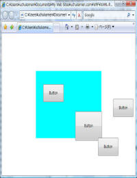
<Page
xmlns="http://schemas.microsoft.com/winfx/2006/xaml/presentation"
xmlns:x="http://schemas.microsoft.com/winfx/2006/xaml">
<Canvas Background="Cyan" x:Name="Canvas"
Width="300" Height="200">
<Button Width="94" Height="53" Content="Button" Canvas.Left="33"
Canvas.Top="39"/>
<Button Width="94" Height="53" Content="Button" Canvas.Left="353"
Canvas.Top="83"/>
<Button Width="123" Height="87" Content="Button" Canvas.Left="180"
Canvas.Top="120"/>
<Button Width="94" Height="53" Content="Button" Canvas.Left="284"
Canvas.Top="199"/>
</Canvas>
</Page>
3.2 DockPanel
DockPanel は、Windows.Formsと同じように子要素をDockの方向を指定して配置できます。LastChildFill
プロパティを true (既定) に設定すると、DockPanel の最終の子要素は常に残りの領域を満たします。
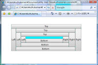
<Page
xmlns="http://schemas.microsoft.com/winfx/2006/xaml/presentation"
xmlns:x="http://schemas.microsoft.com/winfx/2006/xaml">
<DockPanel Margin="58,44,90,76" Background="Cyan" LastChildFill="False">
<Button Content="Top" DockPanel.Dock="Top"/>
<Button Content="Right" DockPanel.Dock="Right"/>
<Button Content="Left" DockPanel.Dock="Left"/>
<Button Content="Bottom" DockPanel.Dock="Bottom"/>
<Button Content="Top" DockPanel.Dock="Top"/>
<Button Content="Right" DockPanel.Dock="Right"/>
<Button Content="Left" DockPanel.Dock="Left"/>
<Button Content="Bottom" DockPanel.Dock="Bottom"/>
<Button Content="Top" DockPanel.Dock="Top"/>
<Button Content="Right" DockPanel.Dock="Right"/>
<Button Content="Left" DockPanel.Dock="Left"/>
<Button Content="Bottom" DockPanel.Dock="Bottom"/>
</DockPanel>
</Page>
3.3 GridPanel
GridPanel は、m x nの格子状に子要素を配置できます。Gridの次元は、ColumnDefinitions,
RowDefinitionsで定義します。
子要素をどのグリッドに配置するかは、1列目: Grid.Column="0"、3行目:Grid.Row="2"のように、指定します。
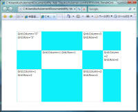
<Page
xmlns="http://schemas.microsoft.com/winfx/2006/xaml/presentation"
xmlns:x="http://schemas.microsoft.com/winfx/2006/xaml">
<Grid Margin="39,53,41,41" x:Name="Grid" Width="515"
Height="347" Background="#FF0EEFFB">
<Grid.ColumnDefinitions>
<ColumnDefinition Width="0.238*"/>
<ColumnDefinition Width="0.392*"/>
<ColumnDefinition Width="0.198*"/>
<ColumnDefinition Width="0.172*"/>
</Grid.ColumnDefinitions>
<Grid.RowDefinitions>
<RowDefinition Height="0.231*"/>
<RowDefinition Height="0.233*"/>
<RowDefinition Height="0.4*"/>
</Grid.RowDefinitions>
<TextBox Grid.Column="0" Grid.Row="0" Text="Grid.Column="0"
Grid.Row="0"" TextWrapping="Wrap"/>
<TextBox Grid.Column="1" Grid.Row="1" Text="Grid.Column=1
Grid.Row=1" TextWrapping="Wrap"/>
<TextBox Grid.Column="0" Grid.Row="2" Text="Grid.Column=1
Grid.Row=2" TextWrapping="Wrap"/>
<TextBox Grid.Column="2" Grid.Row="2" Text="Grid.Column=2
Grid.Row=2" TextWrapping="Wrap"/>
<TextBox Grid.Column="2" Grid.Row="0" Text="Grid.Column=2
Grid.Row=0" TextWrapping="Wrap"/>
<TextBox Grid.Column="3" Grid.Row="1" Text="Grid.Column=2
Grid.Row=0" TextWrapping="Wrap"/>
</Grid>
</Page>
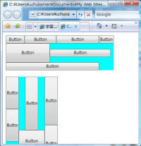
3.4 StackPanel
StackPanelは、縦または横に子要素を配置することができます。ただし、StackPanel
を超える子要素を配置しても折り返してくれません。
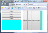
<Page
xmlns="http://schemas.microsoft.com/winfx/2006/xaml/presentation"
xmlns:x="http://schemas.microsoft.com/winfx/2006/xaml">
<WrapPanel>
<StackPanel HorizontalAlignment="Left" Width="200" Height="200"
Margin="10,10,10,10" Background="Cyan">
<Button Content="Button"/>
<Button Content="Button"/>
<Button Content="Button"/>
<Button Content="Button"/>
</StackPanel>
<StackPanel Background="Cyan" HorizontalAlignment="Right"
Margin="10,10,10,10" Width="200" Height="200"
Orientation="Horizontal">
<Button Content="Button"/>
<Button Content="Button"/>
<Button Content="Button"/>
<Button Content="Button"/>
</StackPanel>
</WrapPanel>
</Page>
縦に並べるには、Orientation="Horizontal"を指定します。
3.5 WrapPanel
WrapPanel は、左から右に子要素を配置しますが、右端で自動的に折り返してくれます。
<Page
xmlns="http://schemas.microsoft.com/winfx/2006/xaml/presentation"
xmlns:x="http://schemas.microsoft.com/winfx/2006/xaml">
<WrapPanel>
<WrapPanel Margin="10,10,10,10" Background="Cyan">
<Button Width="58.127" Content="Button"/>
<Button Width="98.127" Content="Button"/>
<Button Width="132.127" Content="Button"/>
<Button Content="Button"/>
<Button Width="136.127" Content="Button" Height="59"/>
<Button Width="188.127" Content="Button" Height="24"/>
<Button Width="288.127" Content="Button" Height="24"/>
</WrapPanel>
<WrapPanel Margin="10,10,10,10" Background="Cyan"
HorizontalAlignment="Right" Orientation="Vertical">
<Button Width="40" Content="Button" Height="100"/>
<Button Width="40" Content="Button" Height="100"/>
<Button Content="Button" Width="40" Height="165"/>
<Button Width="80.127" Content="Button" Height="69"/>
<Button Width="40" Content="Button" Height="149"/>
<Button Width="40" Content="Button" Height="115"/>
</WrapPanel>
</WrapPanel>
</Page>
上から下に並べるには、Orientation="Vertical"を指定します。
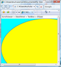
3.6 ScrollViewer
ScrollViewer は、子要素をスクロール可能なビューアーです。ただし、子要素は1つしか持てません。
<Page
xmlns="http://schemas.microsoft.com/winfx/2006/xaml/presentation"
xmlns:x="http://schemas.microsoft.com/winfx/2006/xaml">
<ScrollViewer Background="Cyan" HorizontalScrollBarVisibility="Auto">
<StackPanel >
<TextBox Text="ScrollViewer > StackPanel > TextBox + Ellipse"
TextWrapping="Wrap"/>
<Ellipse Fill="Yellow" Stroke="Blue" Width="600" Height="400"/>
</StackPanel>
</ScrollViewer>
</Page>
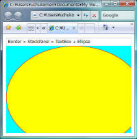
3.7 Border
Borderは、周囲に境界線、背景、またはその両方を描画します。ただし、子要素は1つしか持てません。
<Page
xmlns="http://schemas.microsoft.com/winfx/2006/xaml/presentation"
xmlns:x="http://schemas.microsoft.com/winfx/2006/xaml">
<Border Margin="10,10,10,10" Background="Cyan">
<StackPanel >
<TextBox Text="Border > StackPanel > TextBox + Ellipse"
TextWrapping="Wrap"/>
<Ellipse Fill="Yellow" Stroke="Red" Width="400" Height="300"/>
</StackPanel>
</Border>
</Page>
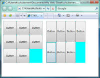
3.8 UniformGrid
UniformGridは、次のように子要素をm x n で等分してレイアウトすることができます。
<Page
xmlns="http://schemas.microsoft.com/winfx/2006/xaml/presentation"
xmlns:x="http://schemas.microsoft.com/winfx/2006/xaml">
<WrapPanel>
<UniformGrid HorizontalAlignment="Left" Margin="10,10,10,10"
Width="202" Background="Cyan" Columns="3" Rows="3">
<Button Content="Button"/>
<Button Content="Button"/>
<Button Content="Button"/>
<Button Content="Button"/>
<Button Content="Button"/>
<Button Content="Button"/>
<Button Content="Button"/>
<Button Content="Button"/>
</UniformGrid>
<UniformGrid Width="202" Background="Cyan" Columns="4" Rows="2"
Height="219" HorizontalAlignment="Right" Margin="10,10,10,10">
<Button Content="Button"/>
<Button Content="Button"/>
<Button Content="Button"/>
<Button Content="Button"/>
<Button Content="Button"/>
<Button Content="Button"/>
<Button Content="Button"/>
</UniformGrid>
</WrapPanel>
</Page>
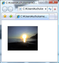
3.9 ViewBox
子要素を伸縮、スケーリングを実行することができます。ただし、子要素は1つしか持てません。
<Page
xmlns="http://schemas.microsoft.com/winfx/2006/xaml/presentation"
xmlns:x="http://schemas.microsoft.com/winfx/2006/xaml">
<Page.Resources>
<ImageBrush x:Key="Brush1" ImageSource="WZero3 015.jpg"/>
</Page.Resources>
<WrapPanel>
<Viewbox Margin="30,30,30,30" RenderTransformOrigin="0.5,0.5"
HorizontalAlignment="Left" Width="150" VerticalAlignment="Top"
Height="130">
<Rectangle Fill="{DynamicResource Brush1}" Stroke="#FF000000"
Width="232" Height="187"/>
</Viewbox>
</WrapPanel>
</Page>
ViewBoxでは、Stretch="Fill"とすることにより、コンテンツをViewBoxのサイズに応じて引き延ばすことができます。
また、ここで Page.Resources により ImageBrushを指定していますがこれは Page
の場合で、Windows アプリケーションの場合は、Windows.Resources になります。
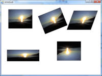
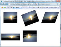
4. 回転、拡縮、スキュー、スケーリング
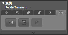
パネルなどの回転、拡縮、スキュー、スケーリングを行うには、RenderTransform を使用します。
Expression Blenであれば、次のペインでRenderTransformの設定を変更することができます。
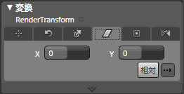
平行移動
<TranslateTransform X="0" Y="0"/>
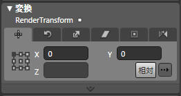
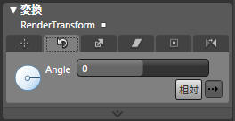
回転
<RotateTransform Angle="0"/>
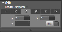
拡大縮小
<ScaleTransform ScaleX="1" ScaleY="1"/>
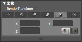
スキュー(傾き)
<SkewTransform AngleX="0" AngleY="0"/>
回転などのときの中心点
RenderTransformOrigin="0.6,0.5"
反転
<ScaleTransform ScaleX="-1" ScaleY="-1"/>
RenderTransformには、TransformGroupとして、ScaleTransform,
SkewTransform, RotateTransform, TranslateTransform
を指定することができます。上記の例であれば、つぎのようになります。
<Page
xmlns="http://schemas.microsoft.com/winfx/2006/xaml/presentation"
xmlns:x="http://schemas.microsoft.com/winfx/2006/xaml">
<Page.Resources>
<ImageBrush x:Key="Brush1" ImageSource="WZero3 015.jpg"/>
</Page.Resources>
<WrapPanel>
<Viewbox Margin="30,30,30,30" RenderTransformOrigin="0.5,0.5"
HorizontalAlignment="Left" Width="150" VerticalAlignment="Top"
Height="130">
<Rectangle Fill="{DynamicResource Brush1}" Stroke="#FF000000"
Width="232" Height="187"/>
</Viewbox>
<Viewbox Margin="30,30,30,30" RenderTransformOrigin="0.5,0.5"
VerticalAlignment="Top" Height="130">
<Viewbox.RenderTransform>
<TransformGroup>
<ScaleTransform ScaleX="1" ScaleY="1"/>
<SkewTransform AngleX="0" AngleY="0"/>
<RotateTransform Angle="-20"/>
<TranslateTransform X="0" Y="0"/>
</TransformGroup>
</Viewbox.RenderTransform>
<Rectangle Fill="{DynamicResource Brush1}" Stroke="#FF000000"
Width="232" Height="187"/>
</Viewbox>
<Viewbox Margin="30,30,30,30" RenderTransformOrigin="0.5,0.5"
HorizontalAlignment="Right" VerticalAlignment="Top" Width="150"
Height="130">
<Viewbox.RenderTransform>
<TransformGroup>
<ScaleTransform ScaleX="1" ScaleY="1"/>
<SkewTransform AngleX="-20" AngleY="0"/>
<RotateTransform Angle="0"/>
<TranslateTransform X="0" Y="0"/>
</TransformGroup>
</Viewbox.RenderTransform>
<Rectangle Fill="{DynamicResource Brush1}" Stroke="#FF000000"
Width="232" Height="187"/>
</Viewbox>
<Viewbox Margin="30,30,30,30" RenderTransformOrigin="0.45,0.7"
HorizontalAlignment="Left" VerticalAlignment="Bottom"
Width="150" Height="130">
<Viewbox.RenderTransform>
<TransformGroup>
<ScaleTransform ScaleX="1.35" ScaleY="0.6"/>
<SkewTransform AngleX="0" AngleY="0"/>
<RotateTransform Angle="0"/>
<TranslateTransform X="0" Y="0"/>
</TransformGroup>
</Viewbox.RenderTransform>
<Rectangle Fill="{DynamicResource Brush1}" Stroke="#FF000000"
Width="232" Height="187"/>
</Viewbox>
<Viewbox Margin="30,30,30,30" RenderTransformOrigin="0.5,0.5"
HorizontalAlignment="Right" VerticalAlignment="Bottom"
Width="150" Height="130">
<Viewbox.RenderTransform>
<TransformGroup>
<ScaleTransform ScaleX="-1" ScaleY="-1"/>
<SkewTransform AngleX="0" AngleY="0"/>
<RotateTransform Angle="0"/>
<TranslateTransform X="0" Y="0"/>
</TransformGroup>
</Viewbox.RenderTransform>
<Rectangle Fill="{DynamicResource Brush1}" Stroke="#FF000000"
Width="232" Height="187"/>
</Viewbox>
</WrapPanel>
</Page>